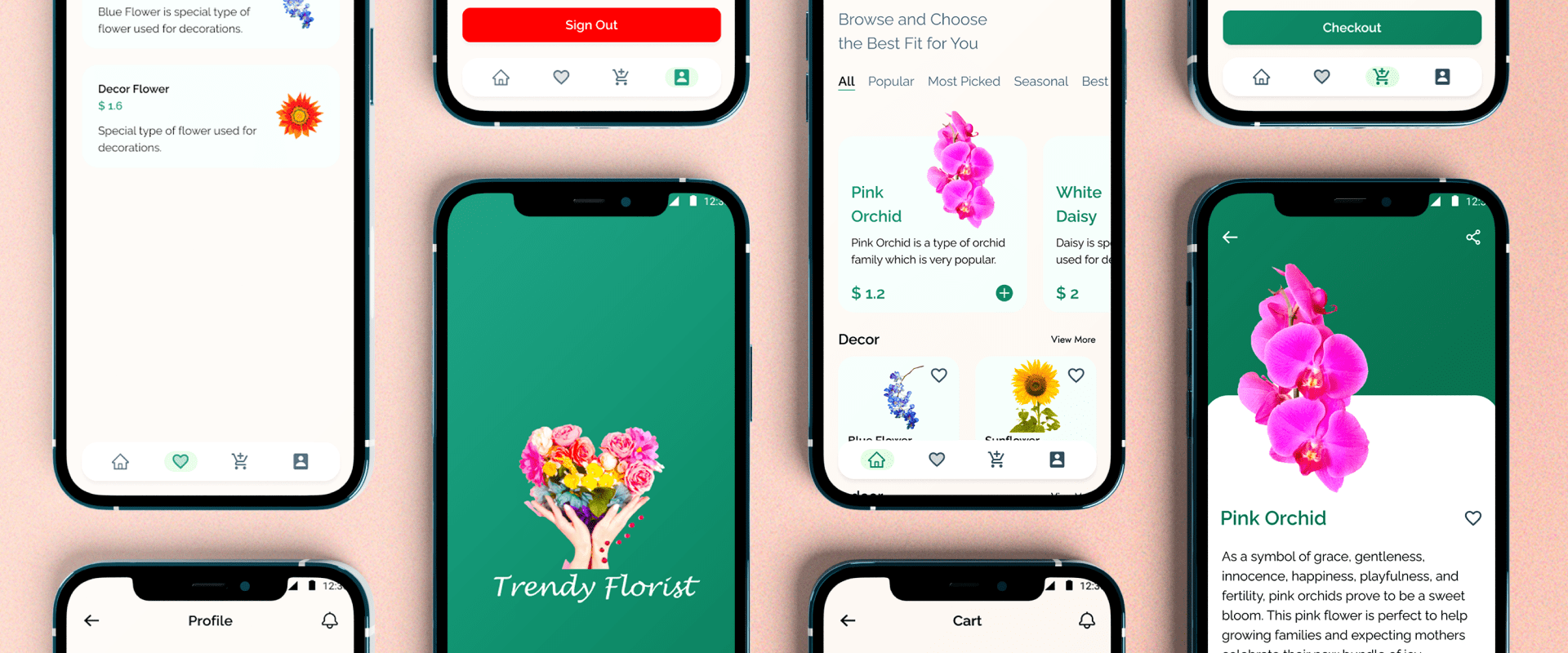
Trendy Florist
UX/UI . Mobile App .
Project Overview
Flower Catalogue app is a marketplace where you can find varieties of flower according to your choice and view their market price with their detail descriptions and can get to your doorsteps in simple steps. You can get flowers of your choice to your doorsteps without having to hustle the market.
My Role
UX Researcher, UI Designer
Project Duration
Sep 2022 - Oct 2022
Tools
Google Docs, Forms, Sheet, Figma, Photoshop
Platform
Mobile Application
Skills Applied
Interviews, Paper & Digital Wireframing, Low and High Fidelity Prototyping, Usability Studies, Design Iterations
The Problem
In our country, there is no proper way to buy flowers online and get delivered, so people need to explore the market and travel which consumed time and effort. People need to explore the market and travel to market which consumed time and effort.
The Objective
Research and design a mobile application that allows users to search and buy flower according to their choice and need then get delivered to the doorsteps.
Design Thinking Process
The process widely used for design thinking which is non-linear and helped me structure my solution in a creative way.

Initial Research
As part of initial research process User Research was conducted which is a survey to gain insights of the needs, preferences and expectations. It was conducted with several question included such as:
How often do you buy flowers from the market and which occasions do you get flowers for?
Do you use website or app to buy flowers?
Do you buy flower after comparing the price?
Are you aware about the detail of the flower or do you buy whatever you are suggested?
Do you know about the types/categories of the flowers?
Are you aware about the price of the specific flower in the market?
What features do you want in the flower app?
What would you like to suggest if you want to have an specific feature?
Summary
I conducted user research and created empathy maps to understand the users I’m designing for and their needs. Many of the users were very keen on online so that they can save time and efforts and the hustle.
The user group did not have much time and detailed knowledge about the flowers when and where to buy. They need to know about the price in the other market so that they do nt get cheated. They want fresh and good flowers for various occasions.
Pain Points
1
Time
Time need to search the flowers they want and hustle to get one in the market.
2
Price
The users do not know about the actual price and need to compare them searching same flower in different shops.
3
Effort
The hustle to get the right flower they need for the required occasion.
4
availability
Users usually do not know when and where they can get those flowers they want.
Research Sprint
First, I created the user personas.
.png)
Key insights
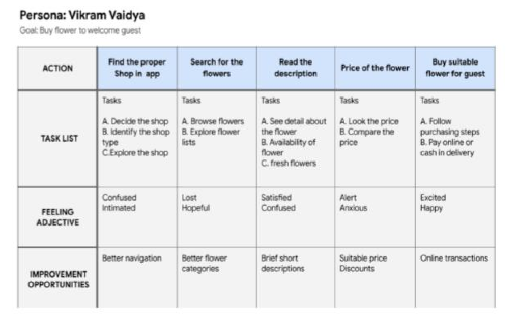
From the user personas developed then, I created the User Journey Map for the app with the collected requirements.
user journey map
Next, after creating the user persona I started with mapping Vikram user journey how helpful it would be for user to navigate from start to finish. Dived into task for understanding the user usning Problem Statements and User Journey Maps.
Next, I started to create the Information Architecture for the website with the collected requirements.
Key insights
Mapping with user journey to make an user flow for the app. I compared with what are the value other apps offer and what are their benefits.
Wireframe
Lets do the rough!
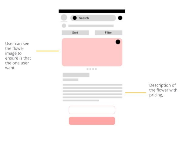
Taking the time draft iterations of each screen of the app ensured the elements that made it to digital wireframes would be well suited to address user pain points.
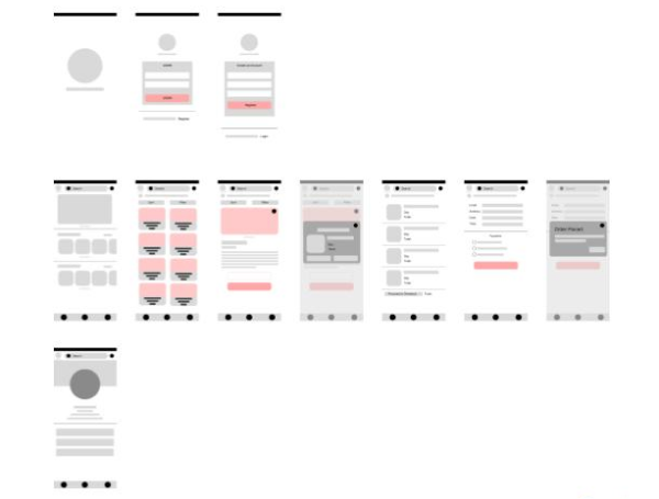
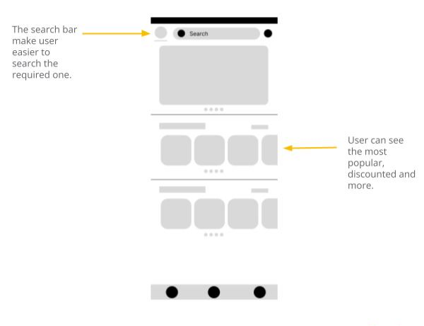
As the initial design phase initiated, I made sure to base screen designs on feedback and findings from user research.
Easy navigation was a key user need to address in designs in addition to equipping the app to work with assistive technologies.
Now lets define the final design’s visual aspects
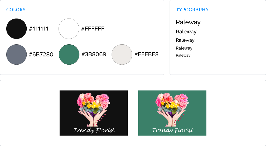
I created moodboards, and defined the visual style which includes logo, color pallet, and typography that will be used in the design.
Usability study : Findings
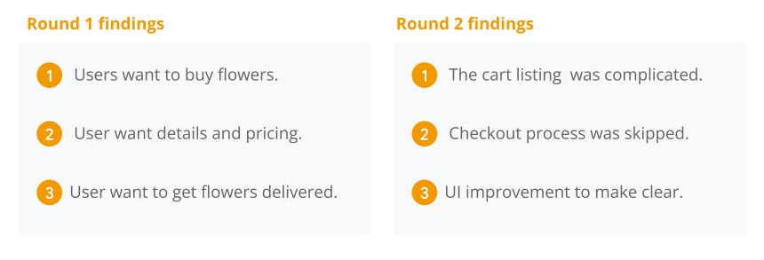
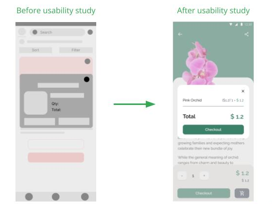
I conducted two rounds of usability studies, findings from the first helped guide the designs from wireframes to mockup. The second one used a high-fidelity prototype and revealed what aspects need improvement.
Mockup
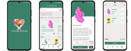
Finally, moving to the actual User Interface. Early designs allowed some customization, but after the usability studies, I made UI more clean so that user can get more results.
The second usability study revealed frustration with adding to card and checkout flow, so I did some research and improvised the design.
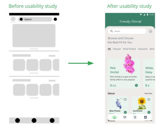
The second usability study revealed frustration with adding to card and checkout flow, so I did some research and improvised the design.
Please feel free to see the Figma file using the link provided below,
Trendy Florist - Mobile App
key takeaways and learnings
While designing, I learned about the user research, empathy mapping, user needs and wants, Lo-Fi and Hi-Fi prototyping.
More improvement on UI to help better user experience.
Conduct another usability study and know other pain points that user are experiencing and improvement on those.
Conduct more user research to determine any other areas of needs.
If you would like to talk about a project and work together, drop me your message!
I am happy to connect with you.